
Day 176: Build Executive Dashboards for Business Metrics
Week 25: Business Analytics Use Cases | 254-Day Hands-On System Design Series Module: Business Intelligence from Log Processing Systems
What We’re Building Today
A C-level executive dashboard that pulls business KPIs from your distributed log processing pipeline
Real-time revenue impact scoring, SLA compliance views, and system health indexes surfaced as board-ready metrics
Role-segmented views: one backend aggregation engine, three audience lenses (CEO, CTO, CFO)
React frontend with auto-refreshing metric cards and trend sparklines — no charting library needed
The Hidden Problem Nobody Talks About
Your distributed log system already knows which requests timed out, which payment flows failed, and which services are degrading. The tragedy is that this intelligence stays locked in Grafana dashboards that only on-call engineers open at 2 AM.
Executives make resource allocation decisions — hiring, infrastructure spend, roadmap priority — with almost no visibility into what the logs already know. Salesforce famously surfaced this problem internally when they discovered their support ticket volume spiked every Monday morning because their weekend batch jobs were silently corrupting user records. The signal was in the logs; it just never reached anyone who could act on it.
Today you close that gap.
Core Concept: Log-to-KPI Translation
Raw logs aren’t business metrics. The translation layer is what makes this lesson non-trivial.
What logs contain:
HTTP status codes, response times, user IDs, endpoint names, service identifiers, error payloads.
What executives need:
Availability percentage, revenue-at-risk from degraded services, customer-impacting incident count, SLA breach rate, mean-time-to-recovery.
The translation pipeline works in three stages:
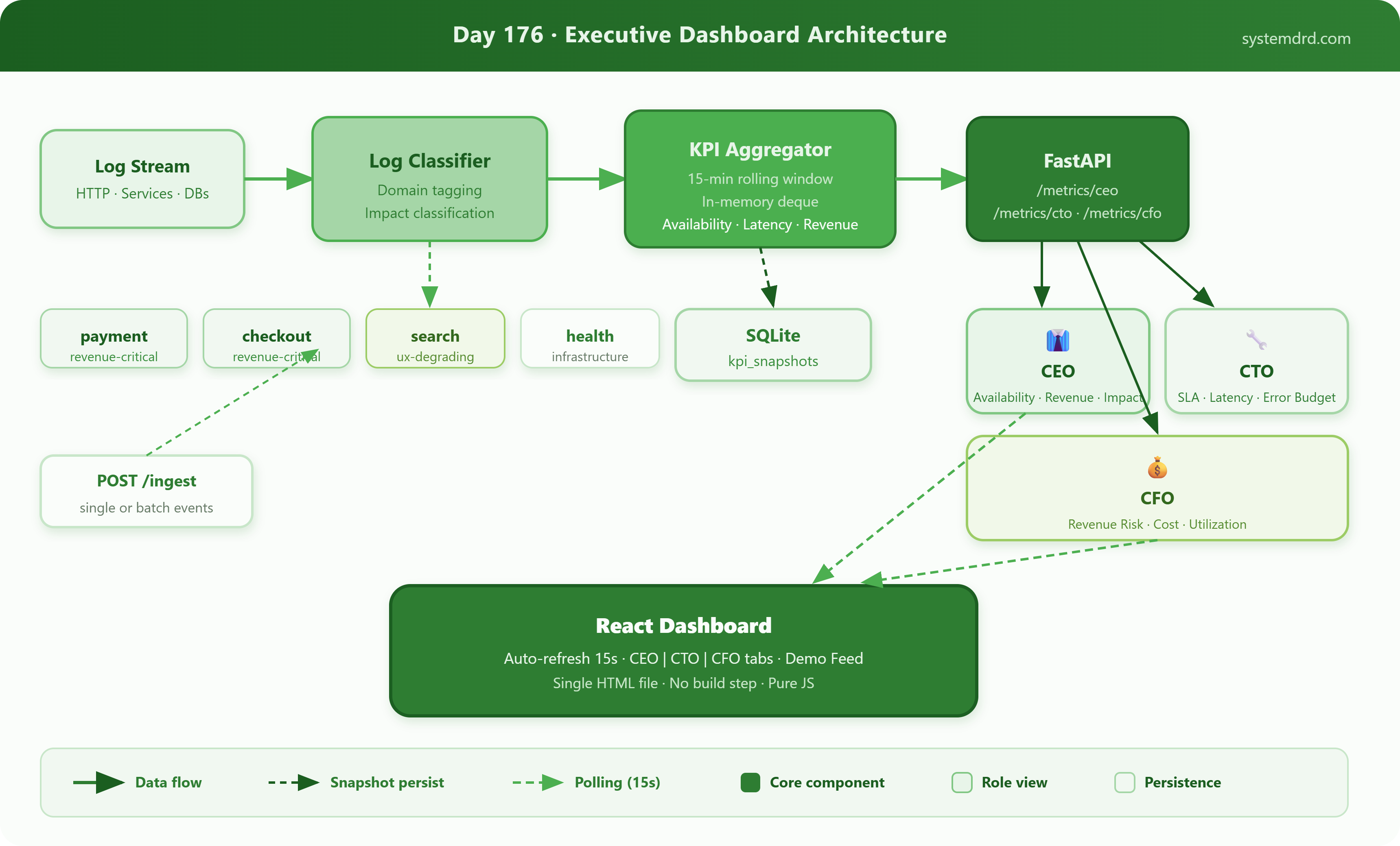
Log Classifier — tags each log event with a business domain (
payment,auth,checkout,search) and impact type (revenue-critical,ux-degrading,infrastructure)KPI Aggregator — rolls up classified events into 1-minute, 15-minute, and 1-hour windows; computes percentages, counts, and weighted impact scores
Dashboard Renderer — serves role-specific views that filter and frame the same aggregated data for CEO (outcome), CTO (system), and CFO (cost/risk) audiences
Architecture
The system extends your Day 175 customer experience monitoring output. The log stream feeds a FastAPI aggregation service that maintains rolling window metrics in memory (using Python’s collections.deque). A React SPA polls the API every 15 seconds and renders three role-specific panels.
Key design choice: No time-series database. Rolling windows held in memory keep the implementation self-contained and fast for a single-node demo — exactly the pattern DoorDash used for their internal ops dashboard before they scaled it to Prometheus.
