
Day 173: Implement Feature Usage Analytics
Yesterday we mapped revenue impact from system issues. Today we flip the lens inward — instead of asking “what broke?”, we ask “what do users actually use?”
Lesson Agenda
Why feature analytics belongs inside your existing log pipeline
The difference between adoption rate, activation rate, and why both matter
Cohort retention and the funnel model
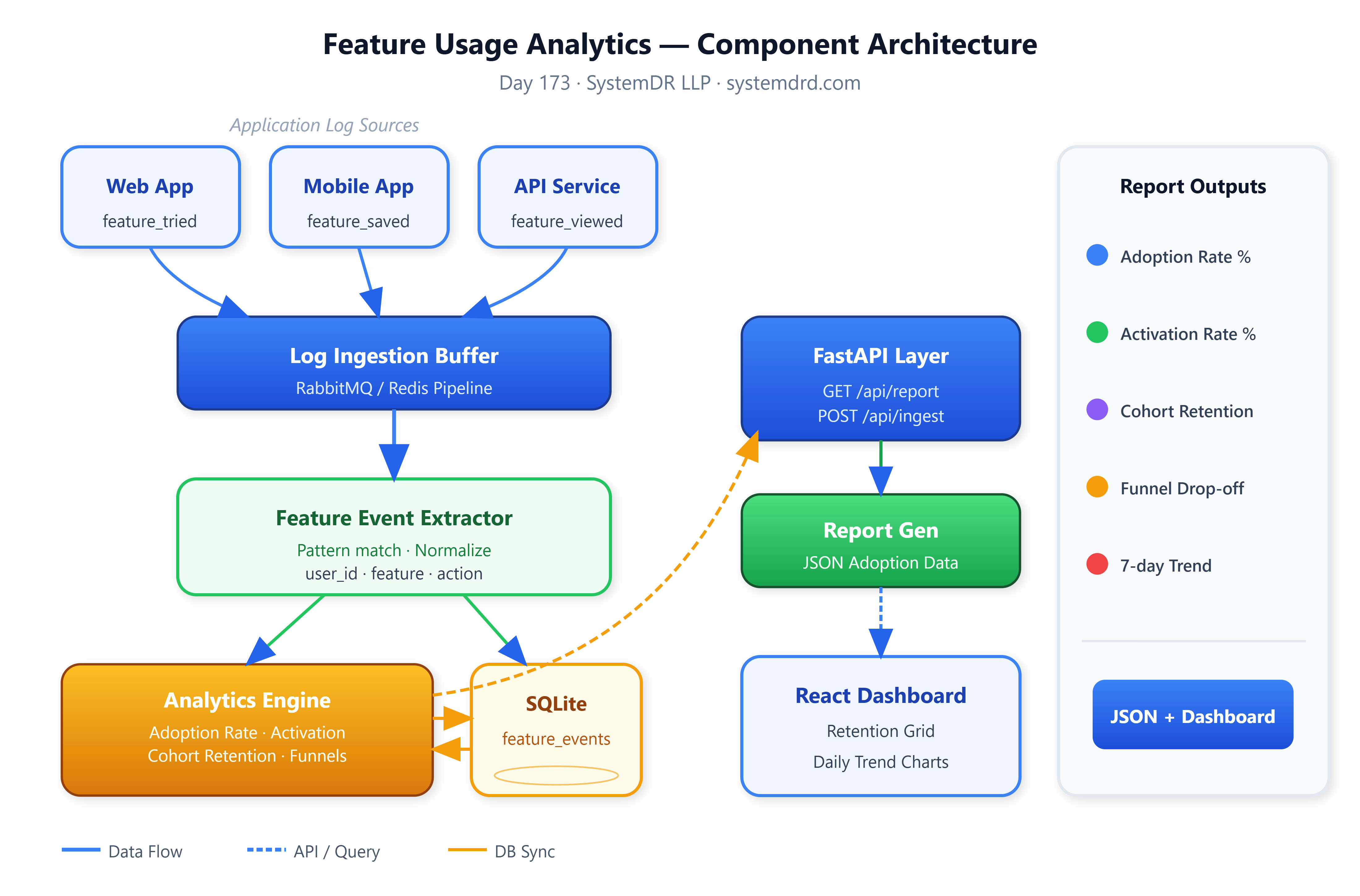
Component architecture and data flow
Building the extractor, analytics engine, and FastAPI layer
React dashboard — adoption table, funnel, cohort grid, trend chart
Step-by-step build, test, and verification guide
Assignment: feature comparison with statistical significance testing
What you will have by the end: A running adoption analytics system that shows which features users discover, activate, and stick with — the same signal product teams at Stripe and Notion use to decide what to build next.
Why Feature Analytics Lives in Your Log Pipeline
Every time a user calls an API endpoint, clicks a UI element, or triggers a backend job, your application emits a log line. Most teams throw these away, or search them only when something breaks. Feature analytics is the practice of treating those same log lines as a behavioral signal — without adding a separate event-tracking SDK.
GitHub does exactly this for Copilot. When Copilot auto-completes a suggestion and the user accepts it, that interaction is already logged through their standard request pipeline. Their adoption dashboard reads the same logs that their SRE team uses for incident response. One data source, two analytical lenses.
The practical consequence for you: the log pipeline you built in Days 31–36 is already producing the raw material. Today’s lesson turns it into product intelligence.
Core Concepts
Adoption Rate vs. Activation Rate
These two metrics sound similar but measure different things.
Adoption rate = unique users who used a feature / total active users in the period. It tells you reach.
Activation rate = users who used a feature more than once within 7 days of first use / users who tried it once. It tells you whether the feature delivered value on first contact.
A feature with 60% adoption but 20% activation is discoverable but disappointing. A feature with 15% adoption and 80% activation is a hidden gem worth promoting. The numbers tell completely different stories, and teams that only track adoption miss half the picture.
Cohort-Based Retention
Raw adoption numbers hide churn. A feature might show growing adoption because new users keep trying it, while existing users quietly abandon it. Cohort analysis groups users by their first-use week and tracks whether they returned in weeks 1, 2, 4, and 8. Spotify uses this exact method to evaluate which features keep listeners on the platform. A flat or growing cohort retention curve is a signal that a feature earns its place in the product.
Feature Funnel
Most features have a natural usage path: discovery, first use, repeated use, power use. By tagging log events with action types — feature_viewed, feature_tried, feature_saved, feature_shared — you can compute drop-off at each step.
Dropbox’s product team famously discovered their sharing feature had 70% discovery but under 10% “shared with a second person.” The funnel showed the problem immediately. Nobody needed to interview users or wait for a quarterly survey; the logs already knew.
Architecture
Preparing for a distributed systems interview?
→Download the free Interview Pack
→ Subscribe now to access source code repository - 200 + coding lessons
